

Formulating and Implementing the t-SNE Algorithm From Scratch

Today, you will learn every detail about t-SNE! I am excited to introduce you to Avi Chawla! He is an exceptional Data Scientist and Data Science content creator, and in this guest post, he presents the most thorough introduction to t-SNE that I have ever seen! Avi is the author of the Daily Dose of Data Science and the Daily Dose of Data Science Newsletter. Make sure to subscribe!
t-SNE is a technique to project dimensional data into a lower dimensional space. It is a dimensionality reduction technique that is often used for data visualization. We are going to cover:
Limitations of PCA
What is t-SNE?
Background: Stochastic Neighbor Embedding (SNE) algorithm
t-Distributed Stochastic Neighbor Embedding (t-SNE)
Implementing t-SNE using NumPy
PCA vs. t-SNE
Limitations of t-SNE and Takeaways

Limitations of PCA
1) PCA for visualization
Many use PCA as a data visualization technique. This is done by projecting the given data into two dimensions and visualizing it.

While this may appear like a fair thing to do, there’s a big problem here that often gets overlooked.
As we discussed in the PCA article, after applying PCA, each new feature captures a fraction of the original variance.
This means that two-dimensional visualization will only be helpful if the first two principal components collectively capture most of the original data variance, as shown below:

If not, the two-dimensional visualization will be highly misleading and incorrect. This is because the first two components don’t capture most of the original variance well. This is depicted below:

Thus, using PCA for 2D visualizations is only recommended if the cumulative explained variance plot suggests so. If not, one should refrain from using PCA for 2D visualization.
2) PCA is a linear dimensionality reduction technique
PCA has two main steps:
Find the eigenvectors and eigenvalues of the covariance matrix.
Use the eigenvectors to project the data to another space.
👉 Why eigenvectors, you might be wondering? We discussed the origin of eigenvectors in detail in the PCA article. It is recommended to read that article before reading this article: “Formulating the Principal Component Analysis (PCA) Algorithm From Scratch“.
Projecting the data using eigenvectors creates uncorrelated features.

Nonetheless, the new features created by PCA (x′0, x′1, x′2) are always a linear combination of the original features (x0, x1, x2).
This is depicted below:
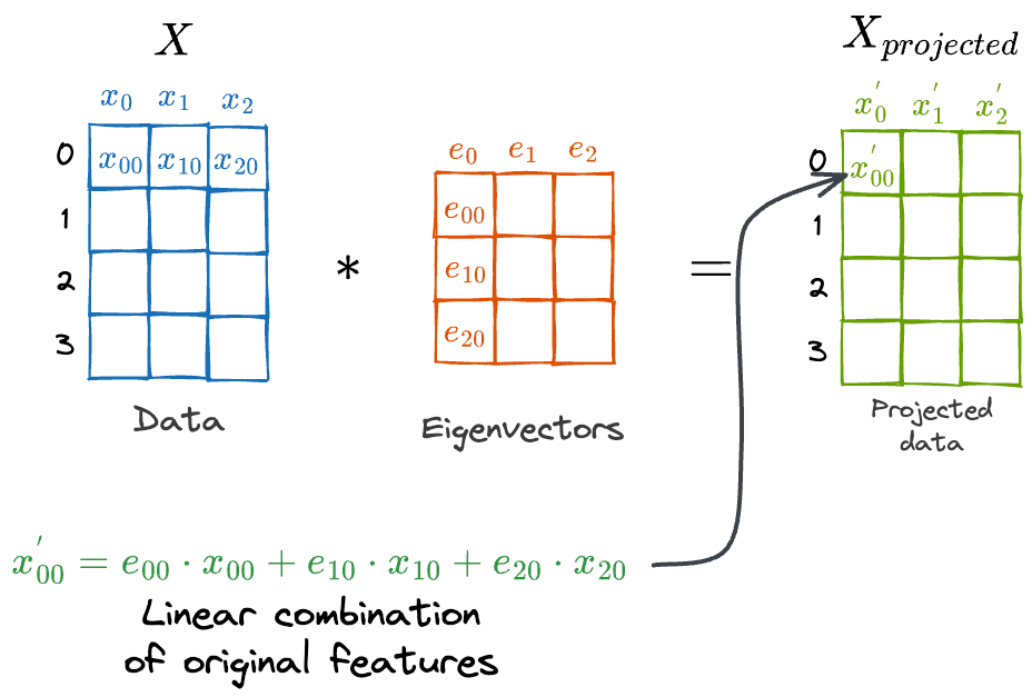
As shown above, every new feature in Xprojected is a linear combination of the features in X.
We can also prove this experimentally.

As depicted above, we have a linearly inseparable dataset. Next, we apply PCA and reduce the dimensionality to 1. The dataset remains linearly inseparable.
On the flip side, if we consider a linearly separable dataset, apply PCA, and reduce the dimensions, we notice that the dataset remains linearly separable:

This proves that PCA is a linear dimensionality reduction technique.
However, not all real-world datasets are linear. In such cases, PCA will underperform.
3) PCA only focuses on the global structure
As discussed above, PCA’s primary objective is to capture the overall (or global) data variance.
In other words, PCA aims to find the orthogonal axes along which the entire dataset exhibits the most variability.
Thus, during this process, it does not pay much attention to the local relationships between data points.
It inherently assumes that the global patterns are sufficient to represent the overall data variance.
This is demonstrated below:
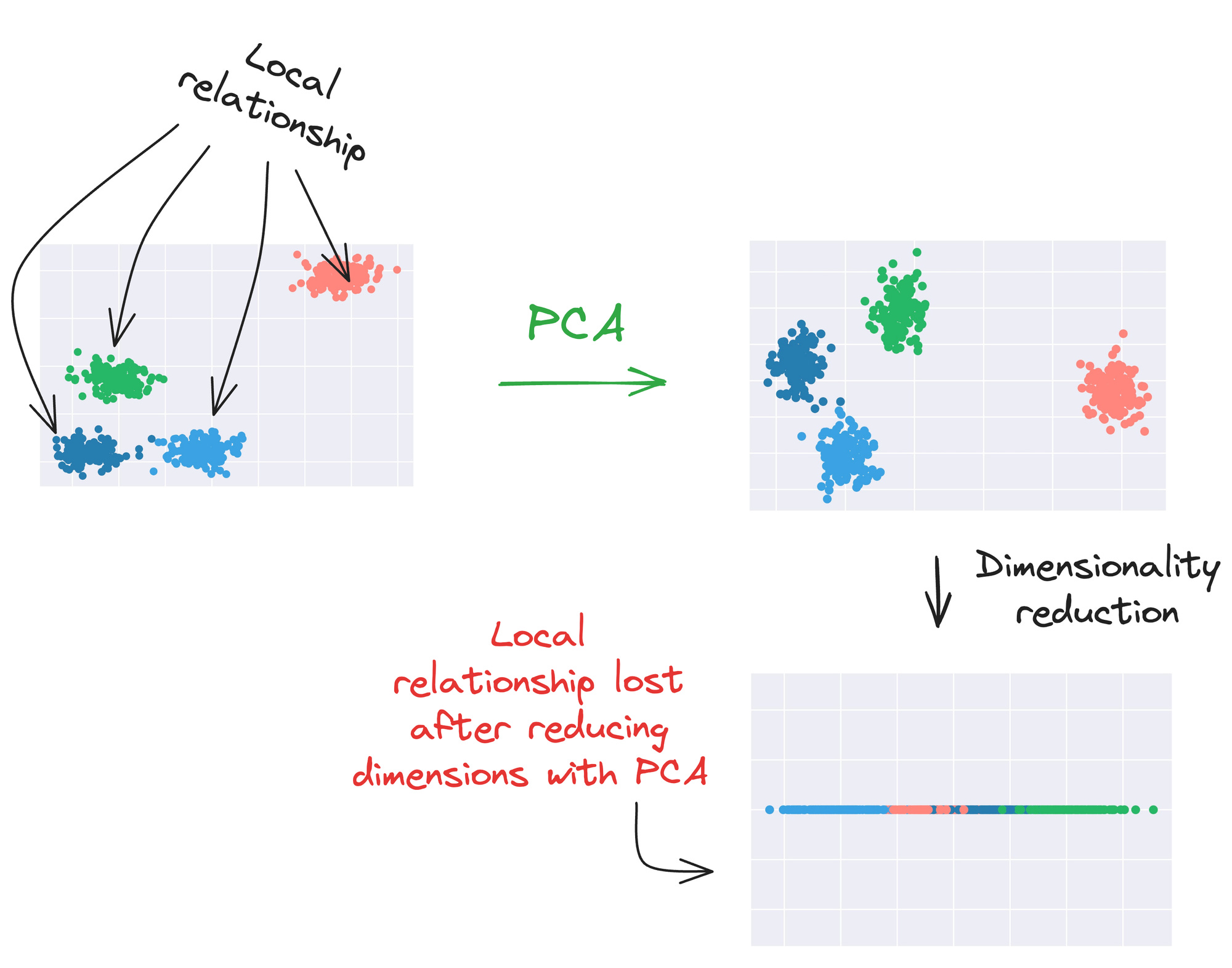
Because it primarily emphasizes on the global structure, PCA is not ideal for visualizing complex datasets where the underlying structure might rely on local relationships or pairwise similarities.
In cases where the data is nonlinear and contains intricate clusters or groups, PCA can fall short of preserving these finer details, as shown in another illustration below:

As depicted above, data points from different clusters may overlap when projected onto the principal components.
This leads to a loss of information about intricate relationships within and between clusters.
So far, we understand what’s specifically lacking in PCA.
While the overall approach is indeed promising, its limitations make it impractical for many real-world datasets.
What is t-SNE?
t-distributed stochastic neighbor embedding (t-SNE) is a powerful dimensionality reduction technique mainly used to visualize high-dimensional datasets by projecting them into a lower-dimensional space (typically 2-D).
As we will see shortly, t-SNE addresses each of the above-mentioned limitations of PCA:
It is well-suited for visualization.
It works well for linearly inseparable datasets.
It focuses beyond just capturing the global data relationships.
t-SNE is an improvement to the Stochastic Neighbor Embedding (SNE) algorithm. It is observed that in comparison to SNE, t-SNE is much easier to optimize.
💡 t-SNE and SNE are two different techniques, both proposed by one common author — Geoffrey Hinton.
So, before getting into the technical details of t-SNE, let’s spend some time understanding the SNE algorithm instead.
Background: Stochastic Neighbor Embedding (SNE) algorithm
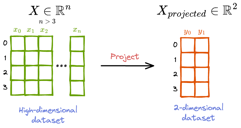
To begin, we are given a high-dimensional dataset, which is difficult to visualize.
Thus, the dimensionality is higher than 3 (typically, it’s much higher than 3).
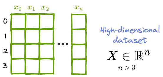
The objective is to project it to a lower dimension (say, 2 or 3), such that the lower-dimensional representation preserves as much of the local and global structure in the original dataset as possible.
What do we mean by a local and global structure?
Let’s understand!
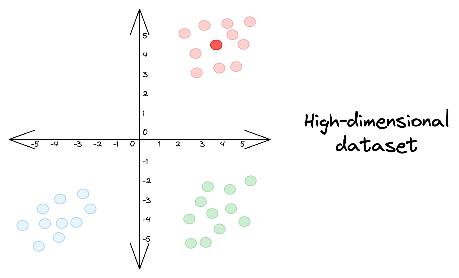
Imaging this is our high-dimensional dataset:

💡 Of course, the above dataset is not a high-dimensional dataset. But for the sake of simplicity, let’s assume that it is.
Local structure, as the name suggests, refers to the arrangement of data points that are close to each other in the high-dimensional space.
Thus, preserving the local structure would mean that:
Red points should stay closer to other red points.
Blue points should stay closer to other blue points.
Green points should stay closer to other green points.
So, is preserving the local structure sufficient?
Absolutely not!
If we were to focus solely on preserving the local structure, it may lead to a situation where blue points indeed stay closer to each other, but they overlap with the red points, as shown below:

This is not desirable.
Instead, we also want the low-dimensional projections to capture the global structure.
Thus, preserving the global structure would mean that:
The red cluster is well separated from the other cluster.
The blue cluster is well separated from the other cluster.
The green cluster is well separated from the other cluster.
To summarize:
Preserving the local structure means maintaining the relationships among nearby data points within each cluster.
Preserving the global structure involves maintaining the broader trends and relationships that apply across all clusters.
How does SNE work?
Let’s stick to understanding this as visually as possible.
Consider the above high-dimensional dataset again.
Euclidean distance is a good measure to know if two points are close to each other or not.

For instance, in the figure above, it is easy to figure out that Point A and Point B are close to each other but Point C is relatively much more distant from Point A.
Thus, the first step of the SNE algorithm is to convert these high-dimensional Euclidean distances between data points into conditional probabilities that represent similarities.
Step 1: Define the conditional probabilities in high-dimensional space
For better understanding, consider a specific data point in the above dataset:
Here, points that are closer to the marked point will have smaller Euclidean distances, while other points that are far away will have larger Euclidean distances.

Thus, as mentioned above, for every data point (i), the SNE algorithm first converts these high-dimensional Euclidean distances into conditional probabilities pj|i.
Here, pj|i represents the conditional probability that a point xi will pick another point xj as its neighbor.

This conditional probability is assumed to be proportional to the probability density of a Gaussian centered at xi.
This makes intuitive sense as well. To elaborate further, consider a Gaussian centered at xi.

It is evident from the above Gaussian distribution centered at xi that:
For points near xi, pj|i will be relatively high.
For points far from xi, pj|i will be small.
So, to summarize, for a data point xi, we convert its Euclidean distances to all other points xj into conditional probabilities pj|i.
This conditional probability is assumed to be proportional to the probability density of a Gaussian centered at xi.
Also, as we are only interested in modeling pairwise similarities, we set the value of pi|i = 0. In other words, a point cannot be its own neighbor.
💡 A Gaussian for a point xi will be parameterized by two parameters: (μi,σi2). As the x-axis of the Gaussian measures Euclidean distance, the mean (μi) is zero. What about σi2? We’ll get back to it shortly. Until then, just assume that we have somehow figured out the ideal value σi2.
Based on what we have discussed so far, our conditional probabilities pj|i may be calculated using a Gaussian probability density function as follows:

However, there’s a problem here.
Yet again, let’s understand this visually.
Earlier, we considered the data points in the same cluster to be closely packed.
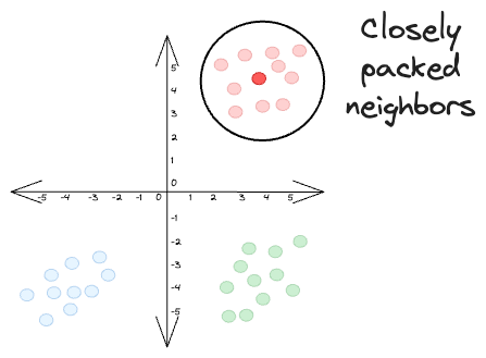
Thus, the resultant conditional probabilities were also high:

However, the data points of a cluster might be far from other clusters. Yet, they themselves can be a bit more scattered, as depicted below:
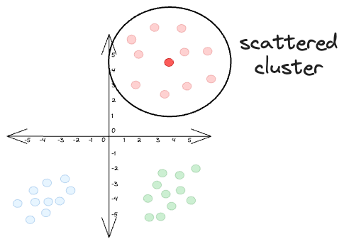
If we were to determine the resultant conditional probabilities pj|i for the marked data point xi, we will get:

In this case, even though the data points belong to the same cluster, the conditional probabilities are much smaller than what we had earlier.
We need to fix this, and a common way to do this is by normalizing the individual conditional probability between (xi, xj) → pj|i by the sum of all conditional probabilities pk|i.
Thus, we can now estimate the final conditional probability pj|i as follows:

The numerator is the conditional probability between (xi, xj) → pj|i.
Each of the terms inside the summation in the denominator is the conditional probability between (xi, xk) → pk|i.
To reiterate, we are only interested in modeling pairwise similarities. Thus, we set the value of pi|i = 0. In other words, a point cannot be its own neighbor.
Step 2: Define the low-dimensional conditional probabilities
Recall the objective again.
We intend to project the given high-dimensional dataset to lower dimensions (say, 2 or 3).

Thus, for every data point xi ∈ Rn, we define it’s counterpart yi ∈ R2:
💡 yi does not necessarily have to be in two dimensions. Here, we have defined yi ∈ R2 just to emphasize that n is larger than 2.

Next, we use a similar notion to compute the pairwise conditional probability using a Gaussian, which we denote as qj|i in the low-dimensional space.
Furthermore, to simplify calculations, we set the variance of the conditional probabilities qj|i to 1/√2.
As a result, we can denote qj|i as follows:
