The AiEdge+: T-SNE and UMAP - Dimensionality Reduction
How to visualize your data!
If you want to impress your friends at Data Science dinner parties with beautiful plots, t-SNE and UMAP are the way to go! These are significant dimensionality reduction techniques widely used in data analysis, machine learning, and data visualization. These techniques are particularly useful when dealing with high-dimensional data, where traditional visualization methods become impractical or ineffective. We look at:
T-SNE
UMAP
Additional learning materials with GitHub repositories, articles and Youtube videos
By the way, if you like the following article, feel free to click the ❤️ button on this post so more people can discover it on Substack 🙏. Thank you!
T-SNE
For the longest time, I had no idea what t-SNE was! For some reason, it was very fashionable a couple of years ago and everybody was plotting their t-SNE visualization of some random data. Every time it came up in a conversation, I would just suddenly have something "very important" to do! I ramped up on it since then, and I am glad I did because it could be quite useful if I want to impress my friends at Data Science dinner parties with beautiful plots!
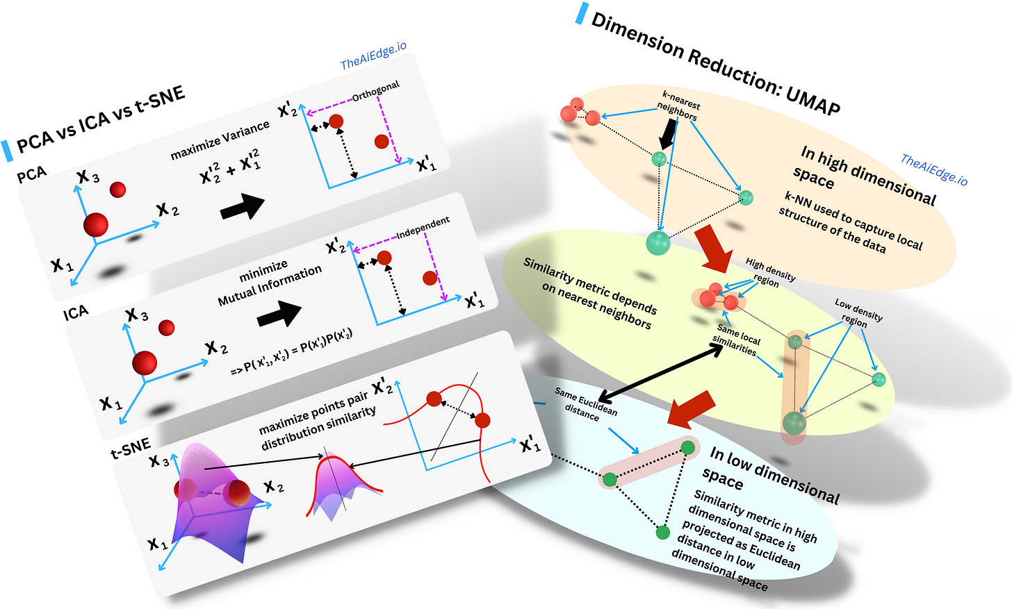
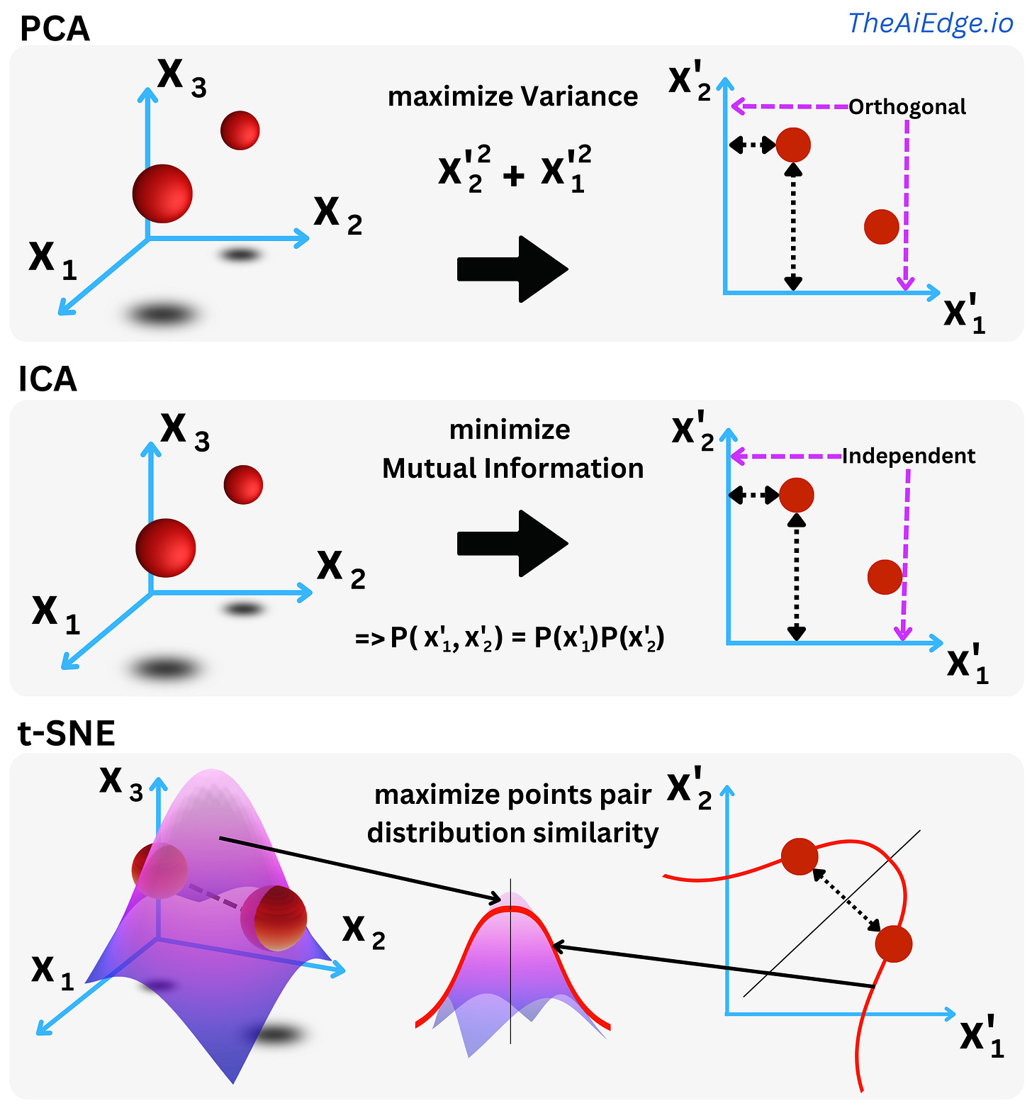
So do you need yet another dimensionality reduction algorithm? In a sense, t-SNE (Stochastic Neighbor Embedding with student's t-distribution) is not too different from Principal Component Analysis (PCA) or Independent Component Analysis (ICA) when they are used for dimensionality reduction: you want to project the data in a subspace that captures more intrinsic meaning of the data than the original space.
For PCA, you rotate the axes to maximize the variance in each direction of the space. As a consequence the new variables (components) are statistically orthogonal. The first components capture more of the actual signal within the data. For ICA, you rotate the axes to minimize the pairwise covariate Mutual Information such that the resulting components are independent in a probabilistic sense. You decompose the data into a linear combination of independent signals. For t-SNE you maximize the similarity between the probability distribution of the pairs of data points in the original space and the pairs of data points in the new space.
Originally Geoffrey Hinton & co (again!) assumed a non-symmetric Gaussian distribution of the data points pair distances for both the original space and the reduced one. It was SNE: “Stochastic Neighbor Embedding”. They then used a Cauchy distribution (student's t-distribution with 1 degree of freedom) to model the pairs in the reduced space and symmetrized the distributions. And this was called t-SNE (because of the student's t-distribution): “Visualizing Data using t-SNE“. The idea was to learn the new components by minimizing the KL distance between the distributions of the 2 spaces such that the distribution of the data in the original space seems similar to the one in the new space. The KL distance is minimized by simple gradient descent. If the new space is 2-dimensional, you can then plot it in a 2D plot preserving the original pairwise proximity of the different data points.
t-SNE is available in scikit-learn if you want to play with it: sklearn.manifold.TSNE. Check out this awesome embedding toolbox by TensorFlow where you can visualize t-SNE: “Embedding Projector”! I feel that one of the silent heroes in the emergence of Data Science in the past decade has been the expansion of data visualization tools. It is less glamorous than many Deep Learning discoveries, but I am not sure where we would be without those!
UMAP
UMAP might be one of the most utilized Dimension Reduction techniques right now, and it is mostly due to the intuitive data visualizations that result from it. One aspect that makes this method somewhat different from other Dimension Reduction techniques is the solid theoretical foundation in algebraic topology and topological data analysis of the underlying algorithm.


